Exploring the potential of Viva Magenta in Interior Spaces
Laurie Pressman(Pantone Color InstituteFebruary 27, 2023)
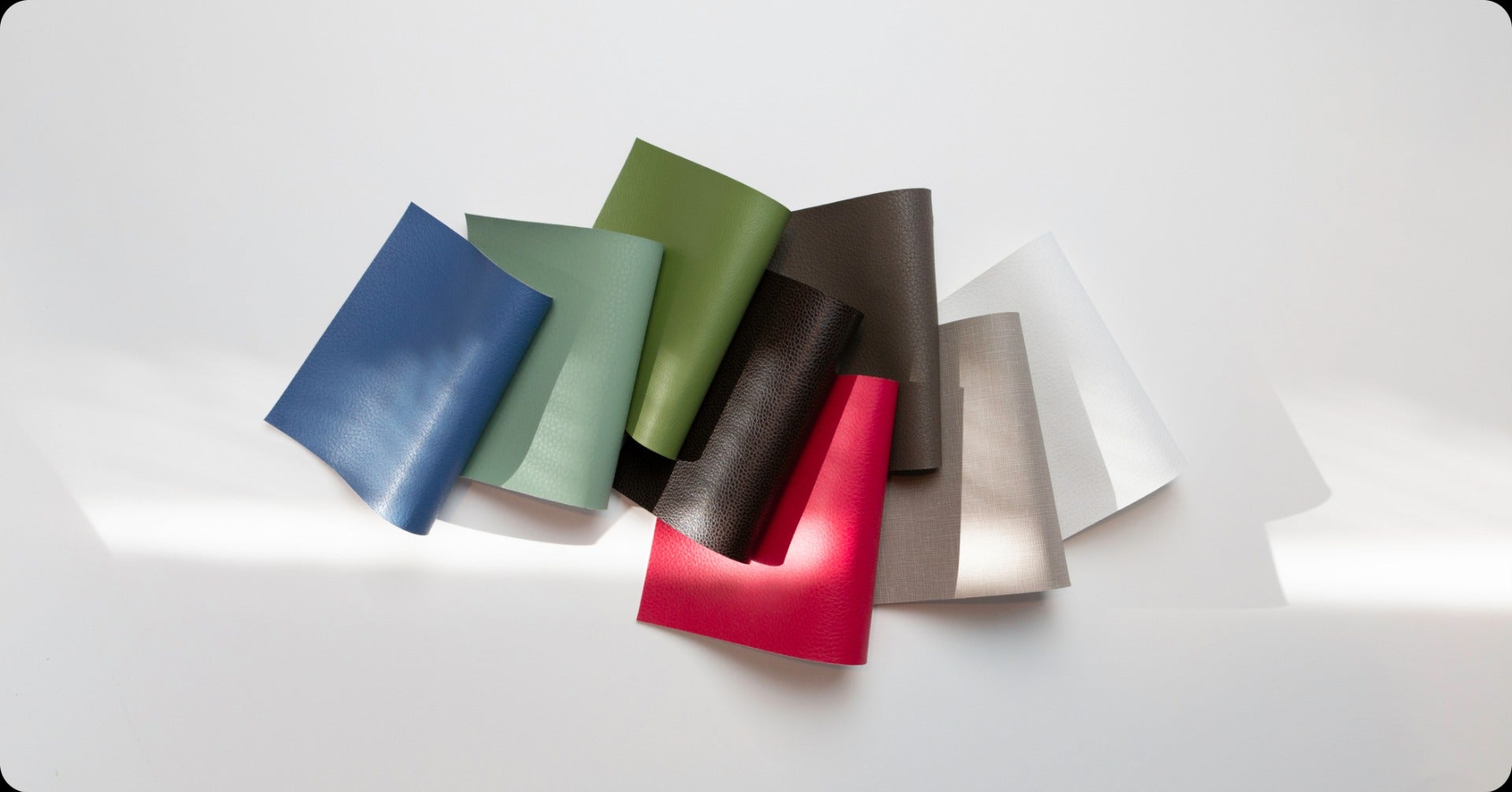
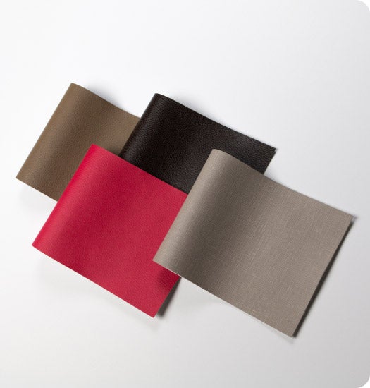
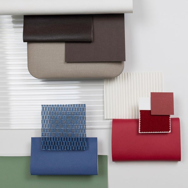
Following the successful launch of the 2023 Color of the Year, Pantone is collaborating with Ultrafabrics—the world’s leading manufacturer of high-tech performance fabrics—to explore real-world ways designers can use Viva Magenta to transform interior spaces. As part of this collaboration, Ultrafabrics created a new color palette, curated by renowned color expert, Kimberle Frost. This exclusive palette, called Awakening, comprises 8 Pantone colors including Viva Magenta to give designers a practical approach to incorporating the vivid hue into spaces.
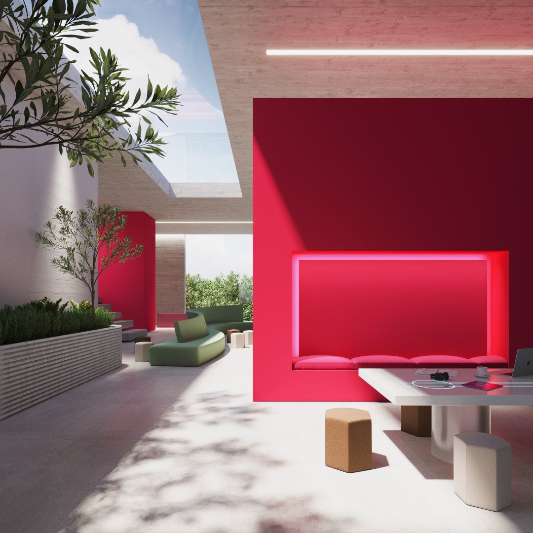
Kimberle approached the palette by first considering the role color plays in interior settings. “Whether you're designing a hotel, hospital, workplace, or home, color is what helps us tell an authentic story that relates to people and creates a human connection,” she observes. Although on its surface, Viva Magenta is a strong, bold red, Kimberle discovered it had a lot of versatility to tell numerous types of stories depending on its context and application. “Working with it alongside different colors, I was surprised to find it’s actually a chameleon. It can be pink, it can be red, it can be warm, it can be cool,” she recalls. Her goal for the palette is to help designers recognize Viva Magenta’s vast potential as both a dramatic splash of color, and a shade that’s perfectly suitable for calm and quiet environments, too.
Engaging deeper with Viva Magenta’s cultural significance and narrative, Kimberle was drawn to how the pandemic led people to “turn to nature for happiness, joy and energy.” This storyline drove her to focus on the color’s origins in nature. The palette embraces earthier color combinations combining the beauty of warm, grounded neutrals with harmonious colors found in nature. “We thought of white as fresh winter snow. As it melts, it reveals the Earth, represented by warm neutrals: mocha and chocolate brown and soft beige. Then there's green, which is the ultimate color of new growth. The blue represents the sky at sunrise. I like to think of Viva Magenta as that little flower that comes out of the ground in the spring,” she says. “It's that pop of energy and color that we need as we’re emerging from this moment of hibernation, an Awakening.”
“Together, these earth tones and neutrals tame the standalone brightness of Viva Magenta,” she says, making this strong color feel more approachable for human-centric spaces from homes to hospitality settings. “Every single color in the palette is usable in interiors, whether on its own, or paired with Viva Magenta,” she continues. “These are warm colors you can use in any part of your space, whether with wood, or metal, or fabric textures.”
The palette works both to inspire designers, and give them the means to use these colors in their current and upcoming projects. To that end, each of the palette colors matches an Ultrafabrics textile that’s ready to be sourced, swatched, and specified. Offering the palette via Pantone Connect along with a physical sample set from Ultrafabrics helps designers envision and feel the possibilities. “When someone is working on a project and sees this collaborative palette or touches our fabric samples, they can start to see how easy it is to use these colors in their spaces,” she says. “They’ll have it already in their hands, ready to go.” Ultimately, the palette is a tool that encourages designers to think differently about Viva Magenta through a new visual context and materiality in real-life settings. “I hope this palette will help designers to say, ‘Hey, I never thought about that,’ or, ‘I love that combination together,’” Kimberle says. “I want them to embrace this fabulous color and use it in lots of different spaces and ways—not just as a representation of what’s happening now, but also in the years to come.”
The Pantone and Ultrafabrics collaboration will continue throughout 2023 with more exclusive palettes and products, and a series of events developed to inspire designers.
View the first of our collaboration Webinar series where Kimberle was joined by award-winning designer Ab Rogers of Ab Rogers Design and Pantone’s own in-house color guru Laurie Pressman, to talk about designing with Viva Magenta and the new Awakening palette.


 Laurie Pressman (Pantone Color Institute February 27, 2023)